
I am Disabled & Proud!
July marks Disability Pride Month—a time not just for celebration, but for honest reflection and learning. This month recognizes the rich history, resilience, and impact of people with disabilities. It also commemorates a pivotal moment in U.S. civil rights history: the signing of the Americans with Disabilities Act (ADA) on July 26, 1990. The ADA wasn’t just paperwork; it was a seismic shift, laying down legal protections and affirming that all disabled people deserve equal rights and opportunities. Disability Pride Month calls on all to see, hear, and genuinely value our contributions, culture, and pride.
Symbols matter. They rally us, they remind us, and they push movements forward. The Disability Pride Flag is a perfect example. Created in 2017 by Ann Magill, herself a disabled activist, the flag was designed as a bold statement: disabled people are here, proud, and more than worthy of visibility. But symbols must also serve the people they represent. By 2021, Magill and the wider disability community realized the original zigzag pattern could actually trigger migraines and seizures for people with certain sensory conditions. So, Magill took feedback to heart. The redesign straightened the lines, muted the colors, and reordered the stripes to be more accessible for people with colorblindness. It’s activism that listened, adapted, and evolved.
The result? The Disability Pride Flag isn’t just a banner. It’s a living emblem of a movement that insists on inclusion, recognition, and joy in diversity. It’s a call to action, asking everyone to break down the stubborn barriers—physical, social, or attitudinal—that keep disabled people from fully participating in everyday life.
Let’s talk details, because the flag is packed with meaning:
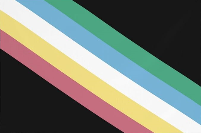
• The black background represents mourning and justified anger for victims of ableist violence, discrimination, and abuse. It’s a reminder that pride doesn’t ignore pain—it honors it.
• The diagonal band slashing across the flag is double-edged. It stands for the barriers disabled people face, but just as importantly, it symbolizes the creativity, brilliance, and hope that cut through those obstacles.
• Each stripe has a job of its own:
○ Red stands for physical disabilities—visible, often misunderstood, and too often overlooked.
○ Gold represents the spectrum of neurodiversity: from autism to ADHD, brains that work differently and enrich society in countless ways.
○ White is for invisible disabilities and those not yet diagnosed. It’s a gentle nudge to recognize what isn’t always apparent.
○ Blue marks emotional and psychiatric disabilities—mental illness, depression, anxiety, and more. No less real, no less deserving of pride and inclusion.
○ Green celebrates sensory disabilities, covering everything from deafness and blindness to sensory processing disorders, and even the loss of smell or taste.
If you look at the flag and only see colors, you’re missing the point. Each element is a story, a history, a rallying cry. Disability Pride Month—and its flag—invites us to move beyond awareness and toward genuine acceptance. It’s not just about making space at the table; it’s about rebuilding the table so everyone fits.
HOME